


+ Brand design
+ Visual identity
+ Environmental design
+ Motion design
+ Art direction
+ Copy writing
One of four Grand Slam tennis tournaments held annually, the Australian Open is both a revered tradition and a chance to view thrilling play. With a passionate fan base numbering in the hundreds of thousands, the Open has evolved from a standard sporting event into a larger festival experience that takes over the city of Melbourne each year.
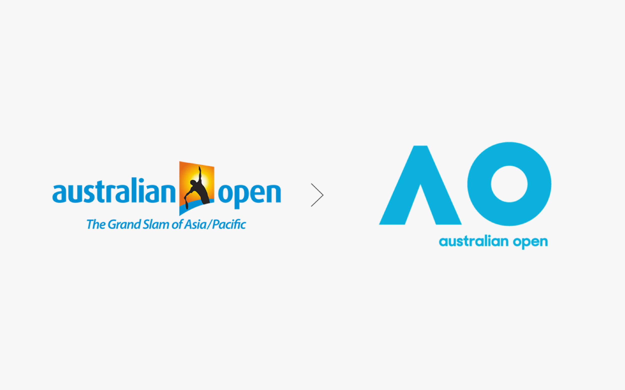
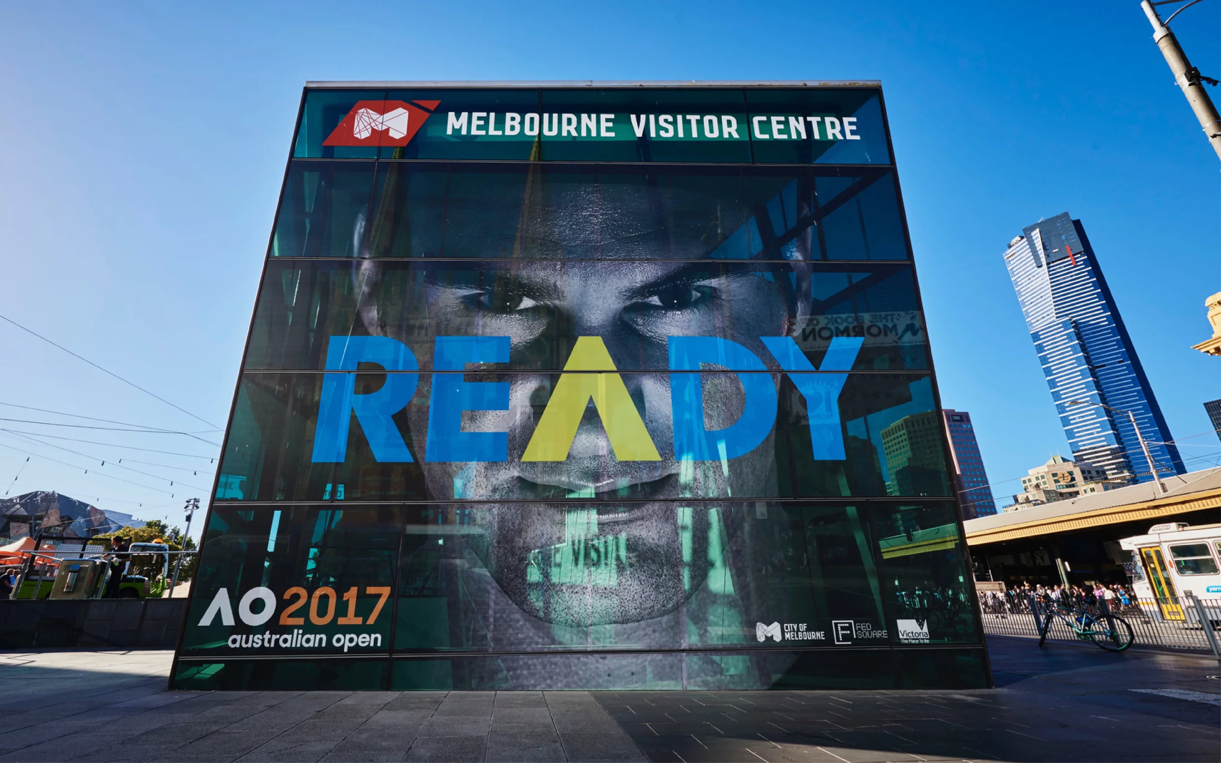
Its look and feel, however, remained dated. Tennis Australia wanted a new identity to reflect the Open’s transformation into a future-focused entertainment brand.
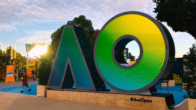
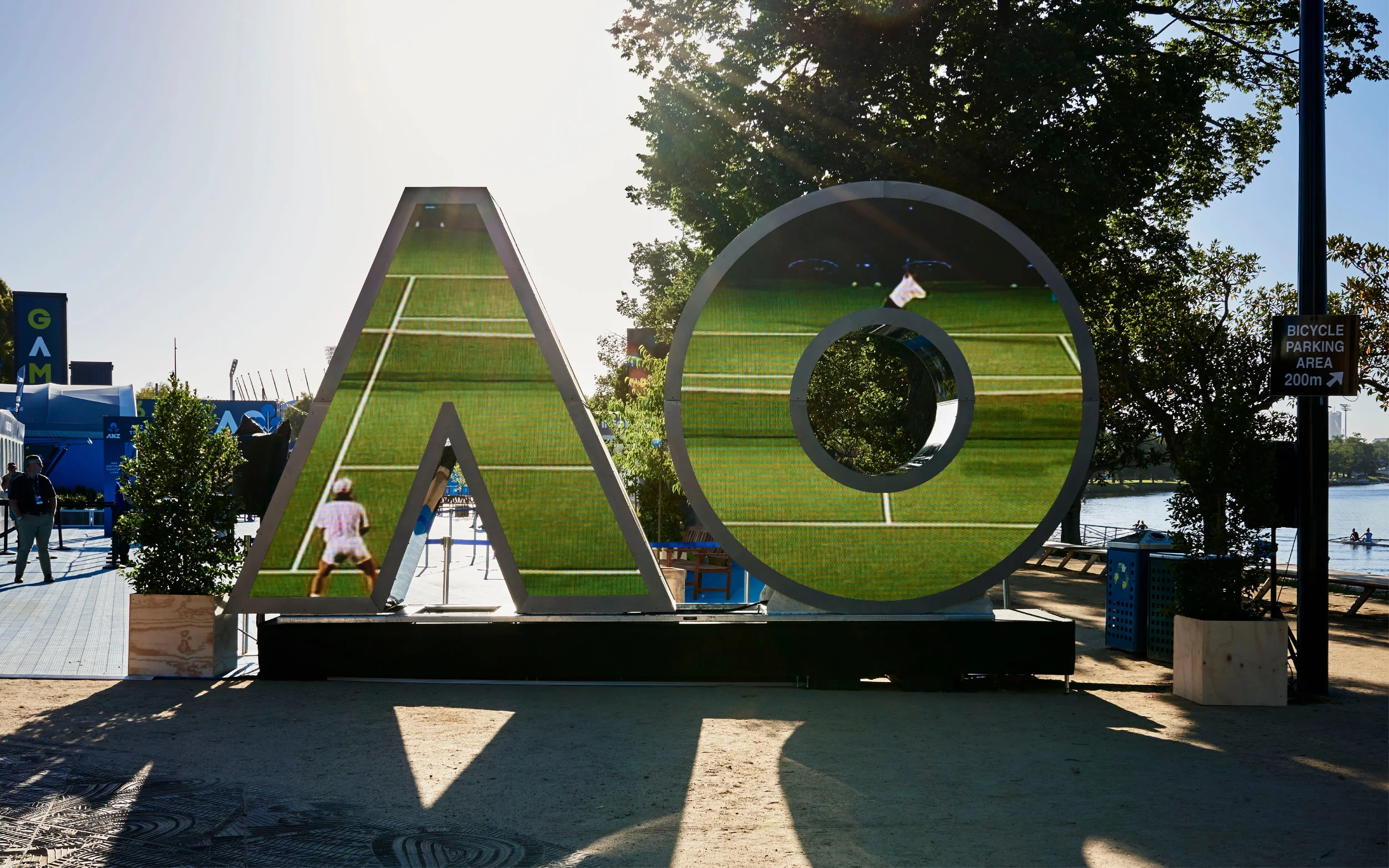
We set out to revitalise the brand, taking “A” and “O” as core components for a new visual identity. Used as geometric symbols, the stylised initials convey energy and motion. As letters, they star in playful word animations.
The flexibility of the visual system makes it easily adaptable to a variety of applications, from digital graphics and social media to tickets and merchandise.
The new brand identity engages audiences and helps to make the world of tennis accessible anytime, anywhere. Fans post upside-down selfies from the Land Down Under. Kids have their faces painted to show support for their favourite players. Live music, gourmet food, and evening sound-and-light shows contribute to the festive atmosphere in true Aussie spirit.